It’s Crunch time!
Designing an Identity & Packaging for a Choco-coated wafer Chocolate with an extra Crunch!
Anmol Crunchy needed a distinctive and eye-catching colour for the Indian market that would highlight the richness of the chocolate and the satisfying crunch of the wafers.
It’s Crunch time!
Designing an Identity & Packaging for a Choco-coated wafer Chocolate with an extra Crunch!
Anmol Crunchy needed a distinctive and eye-catching colour for the Indian market that would highlight the richness of the chocolate and the satisfying crunch of the wafers.
Agency: Elephant Design Pvt. Ltd.
Design Role in the Project: Ideation & Design
Design Team: Ashwini Deshpande, Nidhi Issac, Elodie Nerot, Yugandhara Dalvi Meenakshi Borgohain, Divya Binu, Dhananjay Shinde, Amruta Kalbande

Indulgence, Crunch & Fun
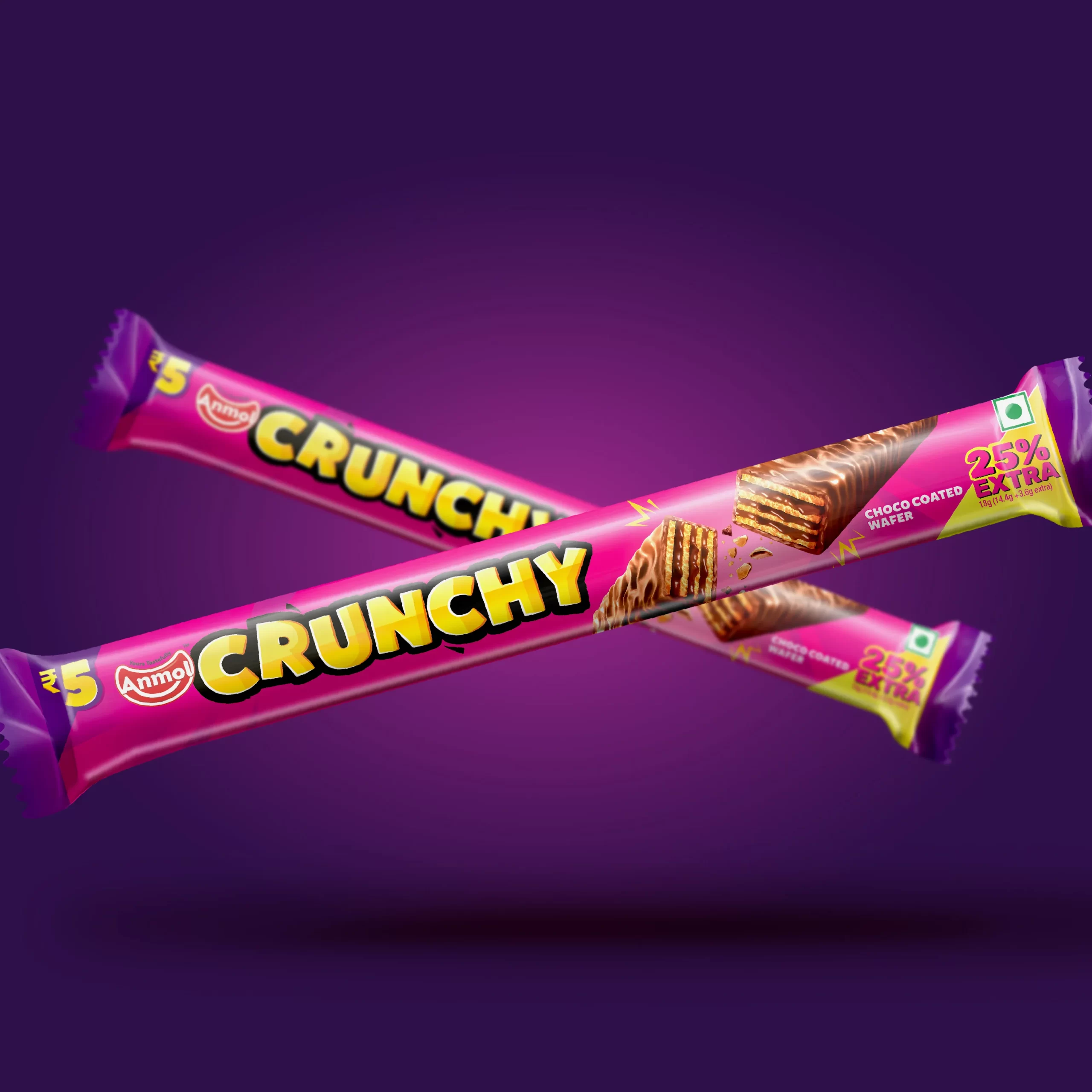
The indulgence aspect was emphasized by depicting delicious chocolate melting between the wafers, while the crunch was accentuated with bits and pieces flying around. The typography of the identity was crafted to enhance the fun and crunchy aspect of the product, with small, rough, bitten-like edges that evoke the natural crunch of the product.
Pink was selected as the main color to help the product stand out on the shelf, with rich purple added for a bold contrast. Yellow highlights the logo, making it more recognizable and prominent on the packaging.

